Nathan Wood is a seriously enthusiastic English graphic designer, working internationally with exciting clients. Based in St Gallen Switzerland building strong partnerships & creating beautiful work.

NC500
The North Coast 500 is a spectacular 500-mile bike ride around the northern tip of Scotland. This zine shows the route and some of the extraordinary scenery you can experience on 2 wheels.
Client: Latency Productions
Photographer: George Huxley & Nathan Wood.


The Power
of Falling
Promotional material for a fantastic one woman show, following the life of the young woman whose world falls apart. Pleasure to work with both Molly and Rose developing the poster series, social posts and tickets for the show.
Client: Molly Dooner
Photographer: Rose Mordaunt


Third Age Bikers
A new online platform for older bikers to connect. Their sole aim is to get more people back riding. It will be a place where tips for older riders can be exchanged, practicalities such as insurance for the older rider, accessories to help you get out on your bike longer, and links to the best local rides.
I worked closely with Anthony to establish a logo that is recognisable, clear, and characterful. It’s very clean and can be applied to anything and everything.
Client: Third Age Bikers
Logo Design


Nora Sans
When your friend has her first baby what can you give her? Yes, a typeface named after her daughter. Nora sans looks to be fun and playful. Child friendly with its curved edges, and I’ve developed the accents and the spectacular eszett character for German.
Client: Nora


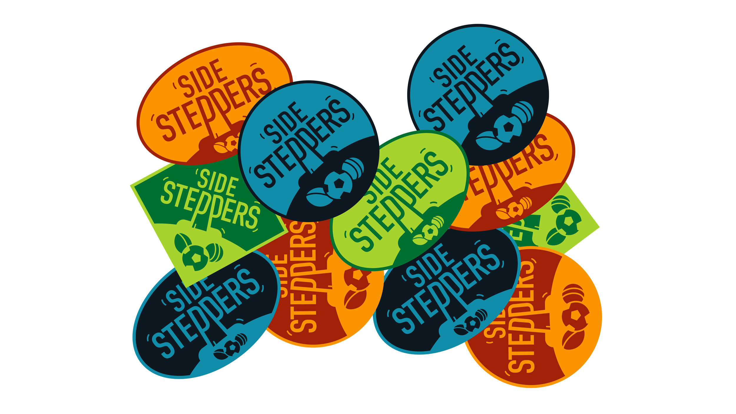
Side Steppers
A summer sports child care service approached me to create a playful identity. Working with Chris we created an energetic logo which we then pumped with powerful colours to really bring it to life.
Client: Side Steppers
Identity Development